
The Challenge
TDS Gift Cards is an innovator and leader providing comprehensive and strategically managed global physical and digital gift card programs. The company works with major brands, and boasts an expansive global network connecting these partners to more than three million points of distribution in 40+ countries globally. TDS had recently gone through a name change due to the sale of their parent company's name, and wanted to create a brand identity that would differentiate them from others in their industry and also create a strong foundation for their internal team to use going forward in a wide variety of marketing channels.
Our Approach
Logo, Brand Elements & Style Guide
With a global trade show just weeks away, we kicked off the project with the TDS Gift Cards team to understand their business, clients, and competitors and as well as how the branding would be applied.
Studio2 refined the existing TDS logo to take it from an interim solution created post-name change, to a strong representation of their brand. After reviewing the competitive landscape, a color palette of a charcoal-navy and white with aqua and orange was established as something that would be differentiated and ownable by TDS.
A font system was established to coordinate with the updated logo, and a brand style guide was created to help their internal team use the new branding and maintain consistency and professionalism in all of their marketing efforts.

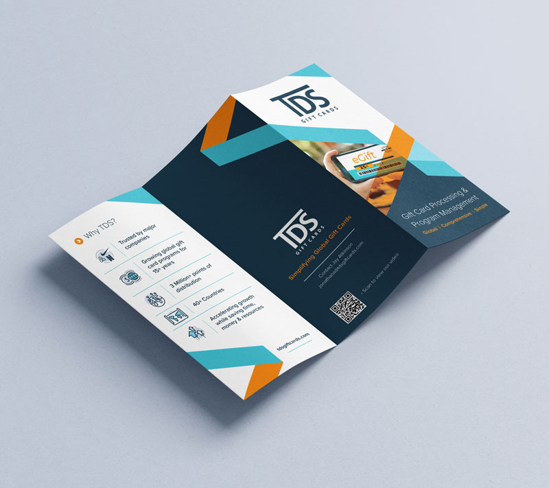
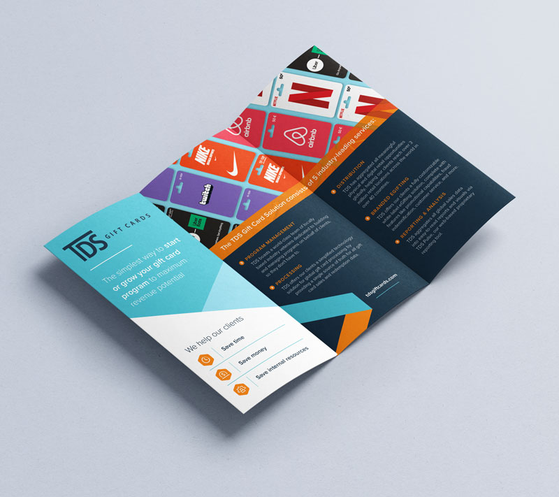
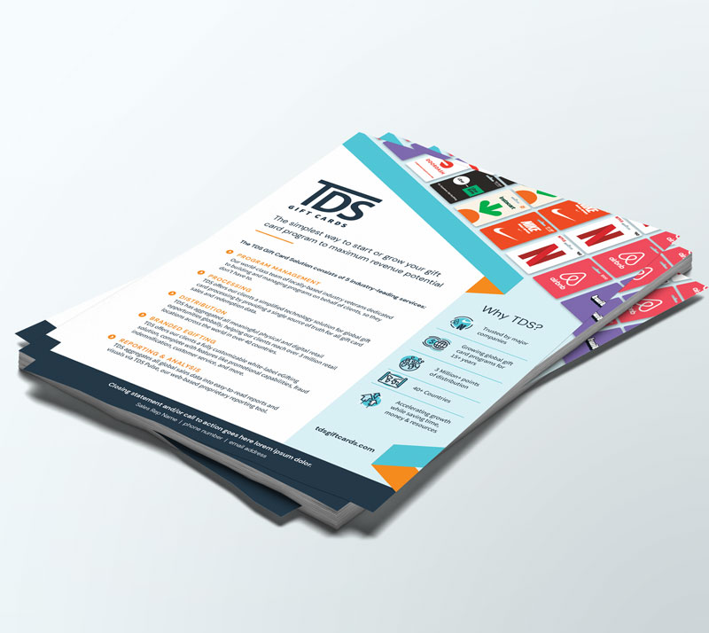
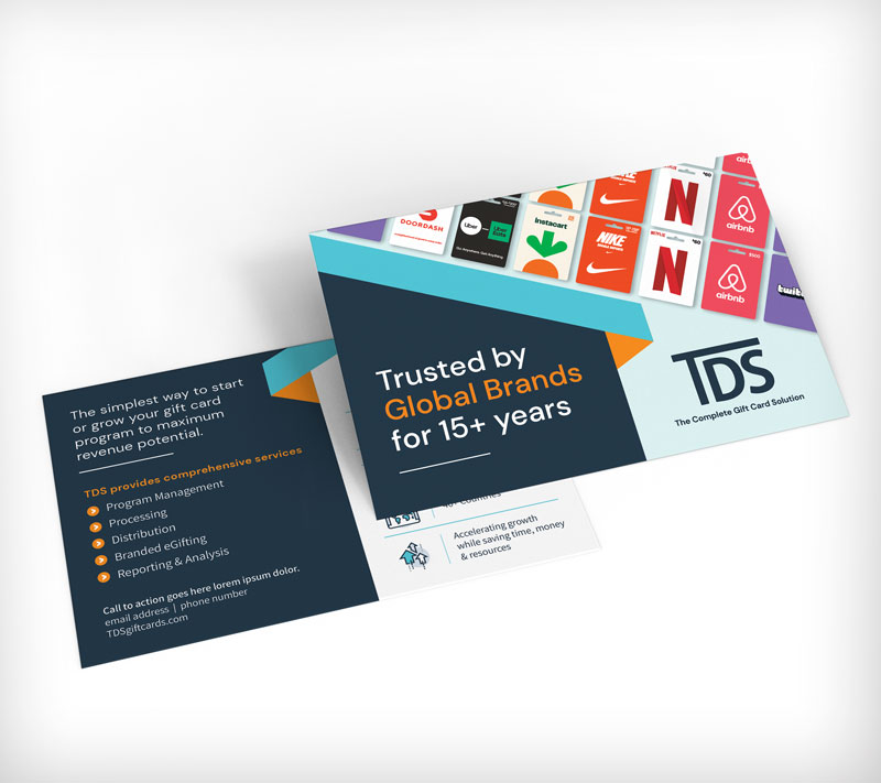
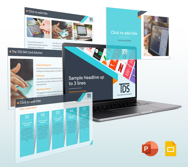
Marketing Toolkit
Knowing that a brand is more than the sum of its parts, the TDS team requested a toolkit of commonly used marketing materials designed with the new branding. These items provide multiple ways that the new visual brand can be used to tell their company story in a compelling way. It also demonstrates how the distinctive new ribbon element can be used to chunk out content into interesting and digestible sections.
The toolkit includes:
- Brand brochure
- Pull-up trade show banners
- One-page handout
- Print ad
- Postcard
- Google Slides deck template
Results


Celebrating 25 Years of
Getting It Right
For a quarter century, we’ve helped our clients cut through the noise with smart strategy, standout design, and digital solutions that help them achieve their goals. Ready for a creative partner who gets it?